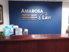
Indoor signs
Sacramento
3/26/2024
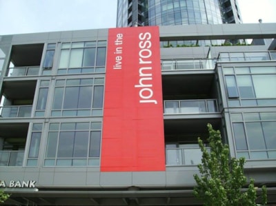
You may have a great-looking sign, but it won't matter how attractive your signage is if your customers can't see it. Ensuring that potential customers can view and understand your message is vital to the long-term success of your business and your brand.
Below is a chart that advises on the appropriate letter height for readability at certain distances. This can be used for both indoor and outdoor signs.
|
Letter Height |
Distance For |
Maximum Readable Distance (feet) |
|---|---|---|
|
3" |
30' |
100' |
|
4" |
40' |
150' |
|
6" |
60' |
200' |
|
8" |
80' |
350' |
|
9" |
90' |
400' |
|
10" |
100' |
450' |
|
12" |
120' |
525' |
|
15" |
150' |
630' |
|
18" |
180' |
750' |
|
24" |
240' |
1000' |
|
30" |
300' |
1250' |
|
36" |
360' |
1500' |
|
42" |
420' |
1750' |
|
48" |
480' |
2000' |
|
54" |
540' |
2250' |
|
60" |
600' |
2500' |
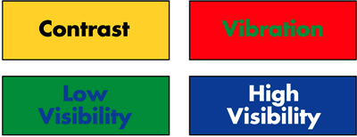
A high-color contrast factor will improve legibility. Here are the best combinations, ranked in order of legibility from a distance.
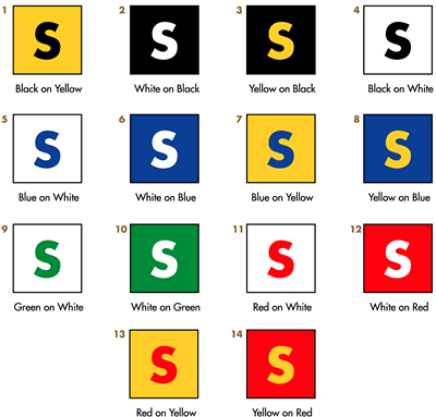
If your branding happens to have a combination of colors that don't contrast well, don't worry! Weak color contrasts can be strengthened with an outline or drop shadow. For outdoor signs especially, this can also help maintain contrast in spite of fading, weathering and other adverse effects.