
Indoor signs

Helena
Helena
10/22/2025
When it comes to office design, color isn’t just about aesthetics, it’s about impact. The hues that surround your employees, clients, and guests influence everything from mood and focus to creativity and communication. While much is said about the best colors to use in the workplace, understanding which colors to avoid in office settings is just as important.
In the modern work environment, design trends lean heavily toward functionality, professionalism, and mental wellness. A poorly chosen wall color or sign background can inadvertently trigger fatigue, distraction, or even irritation. Whether you’re remodeling an office or creating signage, color choices should be made with care and strategy.
Color psychology explores how different hues affect human behavior and perception. In office settings, this psychology plays a vital role in how people interact with their surroundings.
Cool tones like blues and greens tend to be calming and are often recommended for high-focus areas. Warm tones like reds and oranges can boost energy and urgency but may also lead to overstimulation. Neutrals create balance but can become dull if overused.
Yet while each color has its place, some simply don't belong in professional environments either due to their emotional impact or visual discomfort. Let’s explore the most problematic choices.
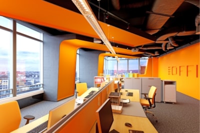
Red is often associated with urgency, excitement, or even danger. While a splash of red can draw attention (and is great for signage that needs to stand out), large areas of red, especially on walls, can be overwhelming in office settings.
In workspaces where focus is required, red may increase tension, raise heart rates, and reduce the ability to concentrate. It's best used sparingly, such as in accent pieces or strategic signage where urgency is warranted (like emergency exits).
Yellow is often marketed as a cheerful and optimistic color, but in reality, bright or saturated yellows can cause eye strain and mental fatigue. When used excessively on walls or signage, yellow tends to bounce more light than other colors, making spaces feel chaotic.
Employees may experience agitation or distraction, and in customer-facing areas, harsh yellows may make the environment feel less grounded or serious. If yellow is used, opt for soft, muted tones, and balance them with neutrals.
While earth tones can create a sense of warmth, dark browns and muddy beiges can often feel outdated, heavy, or uninspiring, especially when applied wall-to-wall or in low-light settings.
These colors can drain energy from a space, making it feel old-fashioned or overly conservative. In creative or collaborative environments, such tones may limit stimulation and reduce innovation. If you must use browns, offset them with brighter tones or texture-rich materials.
Purple, particularly in its brighter or more saturated shades, is often associated with luxury, creativity, and spirituality. But in office design, especially in corporate or minimalist environments, bright purple can feel jarring or off brand.
Too much purple can clash with most neutral color palettes, creating a disjointed experience between your décor, branding, and signage. Subtle lavenders or mauves may work in wellness or beauty settings, but deeper purples should be used with caution.
While white is often chosen for its clean, modern look, too much white, especially cool whites, can make an office feel sterile or impersonal.
In healthcare or legal settings, this might be desirable. But in collaborative or creative spaces, pure white can limit warmth and make environments feel less welcoming. If you opt for white, consider warmer undertones or soft textures that add depth and reduce harsh contrast.
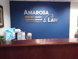
Office design doesn’t stop at the walls. Signage, whether directional, safety, branding, or decoration, plays a major role in how color is perceived throughout the space.
Avoid using any of the colors mentioned above as dominant tones in your signage unless they serve a specific purpose. Red may be necessary for fire exits; yellow may highlight hazards, but neither should dominate your brand identity or directional systems.
Signs should complement the space, reinforce your brand colors, and enhance clarity, They shouldn’t distract or confuse.
Ultimately, the best office environments are those that support the goals of the people working in them. Colors should reduce cognitive load, support employee well-being, and reflect the values of the organization.
Avoiding problematic colors is just one piece of the puzzle. When paired with smart lighting, ergonomic design, and clear signage, a balanced color palette can help elevate productivity, creativity, and morale.
Whether you're revamping your workspace, updating your signage, or opening a new location, Signs Now brings design expertise that goes beyond color theory. Our team helps ensure your visual elements, from branded signage to interior color schemes, are aligned with your goals and optimized for user experience.
Let us help you create a space where color and clarity work together to boost performance and impression.